14th June 2022
The Freedom of Container Queries
If a webpage's layout was an itch and Media Queries are a long, scratchy stick (that is really great but doesn't quite hit the spot), CSS Container Queries are the little claw that turns that plain old stick into a fully fledged back scratcher.
NOTE – At the time of writing this post CSS Container Queries have little to no browser support and the specification is still being developed. To play with container queries you must enable the feature via flags in Chrome chrome://flags/. Chrome’s flags are the browser’s way of allowing users to experiment with potential new features. Enabling flags allows you to try new features that Chrome are working on, some of which will most likely change over time. Enable flags with caution!
You can check up on the browser support for container queries on Can I Use and see the evolving specification on the mdn web docs.
What are container queries?
The concept of container queries has been discussed on the internet for some time and are one of the most exciting recent features coming to browsers! As the spec draws closer to completion, and more browsers pick up support, it’s a great time to consider how they could be used in future projects.
Responsive design brought about a huge improvement to user experience on the web and, using CSS media queries, allowed designers and developers to adjust the way content is displayed across varying screen sizes. Media queries are a core part of everything we build now and it’s hard to think about building without them.
There is an itch, however, that media queries can’t quite scratch. Let’s go to imagination land for a moment.
Say you have a standard news post tile grid, each post with the following elements:
- Image
- Date
- Heading
- Short description
- ’Read more’ link
The posts are in a single column on smaller devices and move to a 3 column grid on larger screens. That’s super easy with a combination of flexbox and / or CSS grid. Throw some media queries and data attributes in there and you’ve got a re-usable, robust grid. Perfect!

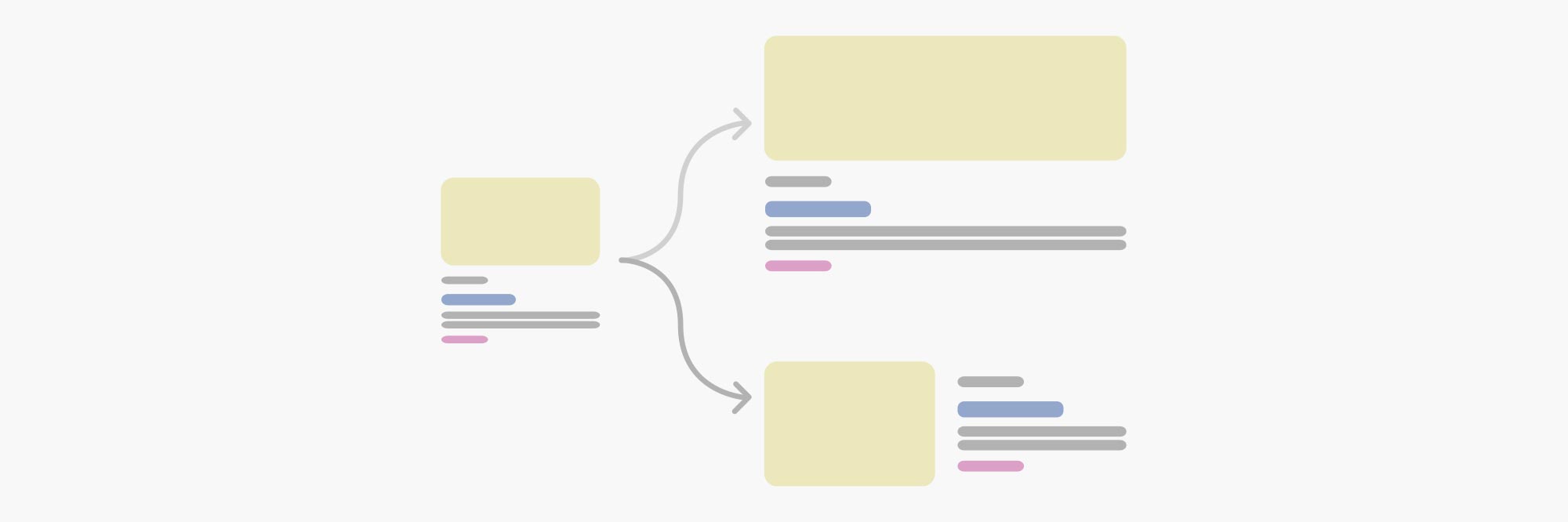
But, as you test the grid on various devices and screen sizes, there’s instances where the columns just don’t quite fit.
Let’s say the browser window is 750px wide. At this size, due to the way we’ve set up our grid, the user will see a single column of content and therefore the post’s image and text will span the full width. As a result the image feels a tad too big on the screen and the line length is too long to read easily. We could tweak the grid so it moves to two columns sooner but that would mean the two posts side by side would be cramped and hard to read. Shucks.
That’s cool, though. Instead of changing the grid you can add some more media query breakpoints to tackle the wide post by splitting the tile into two columns itself! Image on one side and the rest of the content on the other.
But wait! The same post tile is used in a supporting sidebar somewhere else and now it looks strange at 750px. Time to add a class to the tile, or target the parent grid, so we can specify that only post tiles inside the grid should change layout at 750px…
Or, we can have our re-usable grid do its thing and give the post tile container queries so it can decide for itself how it should look!
CSS container queries will allow the freedom for the module to change when it needs instead of us specifically defining when it should.
Can container queries be used in production now?
Unfortunately CSS container queries aren’t quite ready and sit behind flags in Chrome but, with the announcement that CSS container queries will be supported in Safari 16, I’ve got everything crossed that the long awaited feature gains more browser support soon!
To enable the CSS Container Query flag in Chrome, visit chrome://flags/ and search for ‘Enable CSS container queries’. You’ll need to restart your browser after enabling the flag then you’re good to go!
I’ve enabled the browser flag, now what?
Now you can see how container queries look in the browser!
I created a CodePen demo showing how the layout of a page of posts could change based on their available widths.
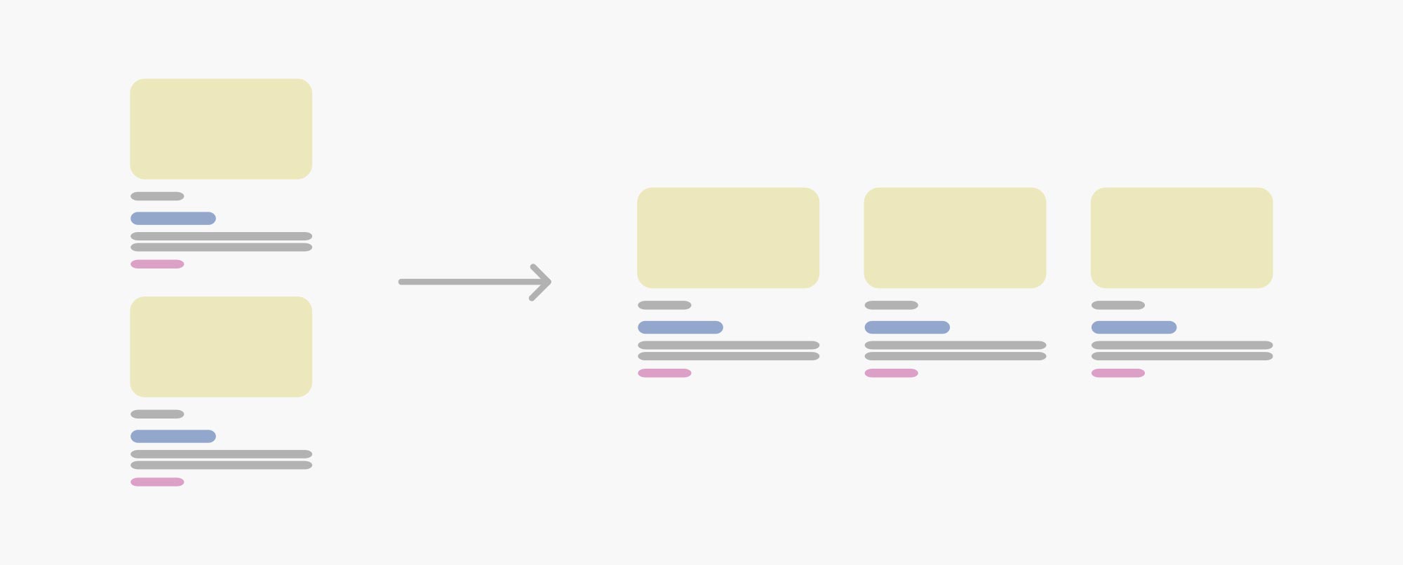
At the smallest browser width all of the the post modules’ content is stacked. As the browser width grows and the grid adapts, so does the layout of the module!
In the demo, all of the posts share the same container width (100% minus a bit of padding) up to around when the browser hits 720px wide and the main grid splits into two columns. Due to the container queries in use, when the browser width pushes past ~540px, all the posts have enough space to split their layout which gives the user more visibility of the content on the page.
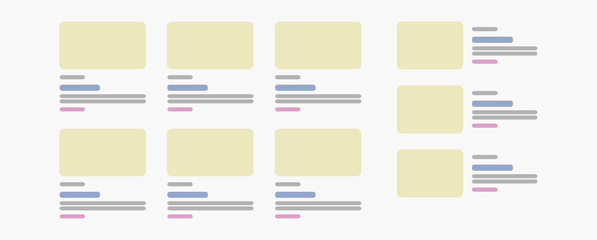
After the main grid moves into two columns, the posts must move back to their stacked content so both the images and content don’t get squashed. The posts that will form the sidebar, however, still have the full width of the browser to play with and retain their two column layout!
There’s no extra CSS classes, no fancy data attributes and no Javascript controlling the changes, it’s all done in the container query. This principle can make a huge difference to how we approach modules from both design and development.
In this use case, there’s very little downside to using container queries. The fallback for the posts, if the user’s browser doesn’t support container queries, is simply the basic, stacked layout used across all browser widths!
As the idea for CSS container queries has been around for a long time, there’s some great articles out there that document the progression of the feature.
Ethan Marcotte’s article ‘On container queries’ was posted in 2017 and outlines the concept and what people wanted for it in an easy to understand way.
Then there’s a great article by Ahmad Shadeed in 2021 which shows practical applications (with supporting code example, imagery and video) of the feature using an early spec for container queries.
The up to date specification information can be found on mdn web docs, although it’s possible it can still change!
I mentioned in a previous post that the container queries feature was incredibly exciting, what new browser features are you looking forward to? Let us know at hello@cargocreative.co.uk.