11th April 2022
Media Queries – Quit (hover)ing around and get to the point(er)
Have you ever visited a website on a nice, big monitor and thought how easy it is to use while navigating through pages and completing forms with your mouse?
Have you ever then visited that website on your mobile or, god forbid, smart TV at a later date and wanted to throw your device or remote out of the window in frustration?
Have you ever got tired of long, tedious questions whose purpose is simply to lead into a larger point?
Sure you have! Maybe using your smart TV’s browser was a bit of a stretch, though…
More devices can access the internet, and there are more input devices used to browse, than ever before but not all of these variables are considered when designing and building websites.
A good while back we put out a post about accessibility where I talked about how important but complex accessibility on the web can be (time, budget, desire and so on) and, although that is most certainly still the case, there are now more tools than ever to help designers and developers in our endeavour to make our websites accessible for everyone.
Whether it be something as useful as @5t3ph’s Button Buddy – where you can learn about, and test, your buttons’ contrast accessibility with the help of a cheeky button character – or help with potential violations and automated tools via the A11y Automation Tracker, this continued push with accessibility is benefitting the entire industry.
Not only have a bunch of these external tools popped up since our last post, but browsers themselves are continuing their relentless march on by giving designers and developers even more native tools to help with the effort.
CSS specifically is in the best place it ever has been and there’s more coming soon™. Something I’m incredibly excited for is CSS Container Queries but we are a little ways away from steady support coming to browsers for those at the moment.
Looping back to the initial questions, long questions really are silly. But what’s not silly are the pointer, hover, all-pointer and all-hover media queries!
What are media queries?
Media queries have been in browsers for quite some time now and are the reason responsive design was able to become a thing. They were initially used to detect things like browser height, width, orientation and screen resolution allowing developers to change how the webpage looked at different screen sizes and on different devices. Pretty dang important stuff!
For example, to add styling for a screen size over 800px, you would add something like this:
@media only screen and (min-width: 800px) {
	…
}
Likewise, you can change your styling for device orientation:
@media (orientation: landscape) {
	…
}
What’s really great about media queries is you can combine them together and get really specific should you need to. An example use case to combine queries could be to target a small range of screen sizes where you need to reduce the font size so it is readable within a smaller container after a layout change:
.text {
	font-size: 1.5rem;

	@media only screen and (min-width: 650px) and (max-width: 800px) {
		font-size: 1.125rem;
	}
}
Now there are a whole bunch of media query options which even allows checking for things like what colour scheme the device prefer (light / dark mode). Although you can get a bit carried away with specificity, the options are very powerful.
Getting to the point(er)
The introduction of hover, all-hover, pointer and all-pointer queries could mean the end of sticking your tongue out in concentration when trying to tap a small checkbox on your mobile device and wondering why you can’t see a link’s description because the call to action requires a hover (or long tap on touch devices) for it to be revealed.
Realistically, putting aside the dramatics for a moment, we have been able to cater for varying screen size requirements with height and width media queries but that comes with some assumptions. Generally that small screens means touch mobiles, medium mean touch tablets OR touch pad laptops and large means desktops with a mouse. This might be the case for most people but it’s still an assumption.
So, how do they work?
In the same way other media queries are structured, the hover and pointer queries detect the device’s capabilities and categorises the results into options.
hover detects if the users primary input can hover and assigns one of two values:
none– the primary input mechanism can’t hover (e.g. mobile devices)hover– the primary input mechanism can hover (e.g. desktops, laptops or when using a stylus)
pointer detects the accuracy of the users primary input and assigns one of the following values:
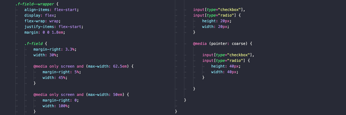
none– no primary input mechanism (e.g. some mobile devices)coarse– the primary input mechanism has limited accuracy (e.g. some mobile devices or remotes for TVs or consoles)fine– the primary input mechanism is very accurate (e.g. a mouse, touchpad or device stylus)
I set up a quick and basic example CodePen outlining how these queries can work (you can test the outcomes using Chrome DevTools and various settings in the Device Toolbar).
The any- versions of the queries checks any of the input mechanisms, not just the primary, and assigns the same values based on the results. This key difference is incredibly useful if a user has multiple input mechanisms available. This may seem quite niche for the majority of use cases but it helps, for example, when users have bluetooth accessories connected to their touch device or a laptop with touch screen capabilities. In these cases both hover values and both coarse and fine pointer values could be true.
If you combine these with the existing height, width and orientation queries, we now have even more control over when to tweak sizing, spacing, colour and shape depending on the users needs.
Smashing Magazine has a full guide to hover and pointer media queries which I would highly recommend checking out if you want to know more.
Yes, this is another rabbit hole but it intersects with many others; all with the same end goal to make websites easier and more friendly to use for all, regardless of ability or circumstance.
Browser support for the queries can be found on Can I Use for both hover and pointer.
MDN documentation can also be found here for both hover and pointer.