25th November 2015
Brand Workshop: Design Accessibility for Ophthalmology Patients
We have recently embarked on a project for our longstanding client Making Research Better. After we originally delivered some print materials and a website, they came to us with the new challenge of individually targeting their Ophthalmology patients.
Now I must admit as we started the project I had no idea what the term ophthalmology meant, never mind had any experience working in this specific area. For anyone unsure on what the term ophthalmology refers too, it is the science and medicines behind eye health and disorders. I have however, worked on many campaigns for the NHS, including Healthy Heart Checks and Drug Addiction services. Also having delivered several campaigns for Cleveland Fire Brigade around home and fire safety, I felt I had some experience to draw on.
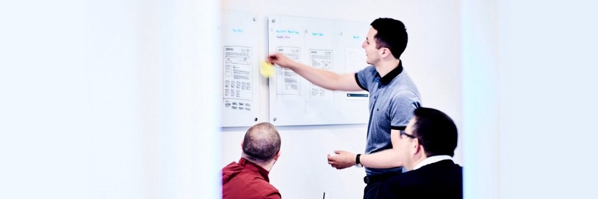
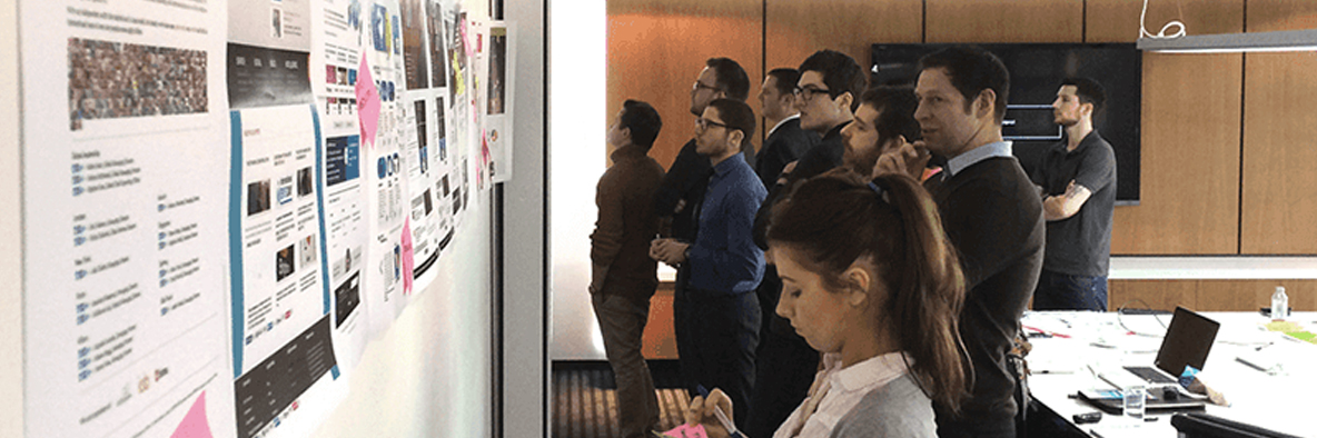
With the nature of the project, we decided that a brand and design workshop would be vital to its success. I believe good design always focuses on its audience and if there is ever to be a project where that resonates, then this was definitely it. With our workshops the idea is to have a clear direction for the project by the end. This is generally achieved through a form of a/b testing. With this particular project we presented two design routes that in truth only showed very subtle differences. In hindsight, I think I should of designed two completely different routes. Considering the audience it was sometimes difficult for them to truly understand and see the differences, however this didn’t hinder our progress – it just made presenting slightly more difficult.
The designs themselves needed plenty of consideration, never have the elements of one of our designs needed such scrutiny. The colour needed to be high contrast, which meant we used either black text on yellow or a combination of black and white throughout the designs. The text size had to be more than 16pt at all times with line spacing up to at least 1.5 times. The text in main call to actions always needed a capital letter as it creates a more recognisable shape of each word. Even telephone numbers needed further consideration, as spelling out the number makes it more readable. In addition to this the two variations tested shades of colour, most notably a bright yellow against an earthy yellow. We looked at the use of highlighting information, the justification of text, boldness of fonts and underlines or italics. Then finally we tested the different stocks for the print, we tested the weight by ranging from 150gsm to 300gsm and the finish by using coated and uncoated. We had all of these ideas around the design, which where great and really interesting to work with however the main question still remained: could the audience use the materials?
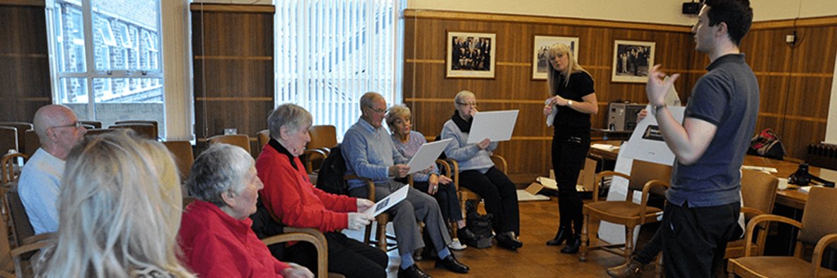
On the day of the workshop we presented the following: an adapted brand, posters, sign up forms, leaflets and website. After an initial scare, with the first opinion being “I hate them all!” while presenting the new adapted brand, the workshop ran very well. It turns out the first person to comment had trouble seeing things on black backgrounds and didn’t quite understand it was just the logo we were analysing. Phew! But in all seriousness we found some really valuable pieces of information, for example one shade of yellow was better at distance and the other was better close up. Mixing the colours up in sections helped give the readers eyes a rest, which made focussing on longer passages of text easier. Messaging needed to be short, sharp and punchy. If it looks like it’s going to take a long time to read they probably won’t read it. Underlines and italics confuse things and a consistent use of a font weight helps. This means the eye doesn’t need to re-focus. Equally we found that the uncoated and heavy stocks helped make it much easier to use. This feedback, along with the many other pieces, gave us so much insightful information that otherwise we would never of had.
The information we gained was incredible and it really helped us focus our efforts and designs. It was a real lesson for me as a designer, day to day I spend a lot of time making sure certain details are pixel perfect and yet this proved to me that every potential audience member is different. The project was about finding a comfortable middle ground that will work for all. At the end of the day we want this project to help the people who need it. It’s not massaging any ego, it’s not going to make the next issue of Computer Arts, it’s just simply going to help people. So whether or not I preferred one route over the other is irrelevant because hopefully these designs only focus on the people that matter… their audience.
If you would like to learn more about ophthalmology research going on in the North East, visit the Making Research Better website.