22nd November 2019
Warner Bros update their famous shield logo
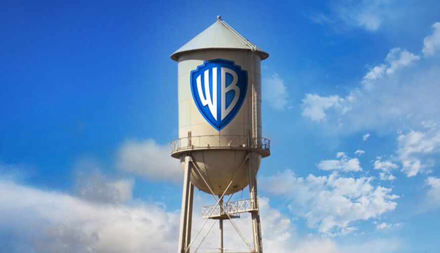
Warner Bros and Pentagram have worked together to update the famous shield logo, bringing a “sleek and clean” brand reinvention.
The slimmer shield shape takes guidance from the golden ratio principle and a livelier shade of blue elevates the logo and helps it stand out from the ever-growing crowd. Pentagram also introduced a new typeface ‘Warner Bros. Sans Condensed Bold’, which makes the brand more adaptable and diverse to how people view Warner Bros today. We think this rebrand is brilliant!
Read more on the It’s Nice That website.